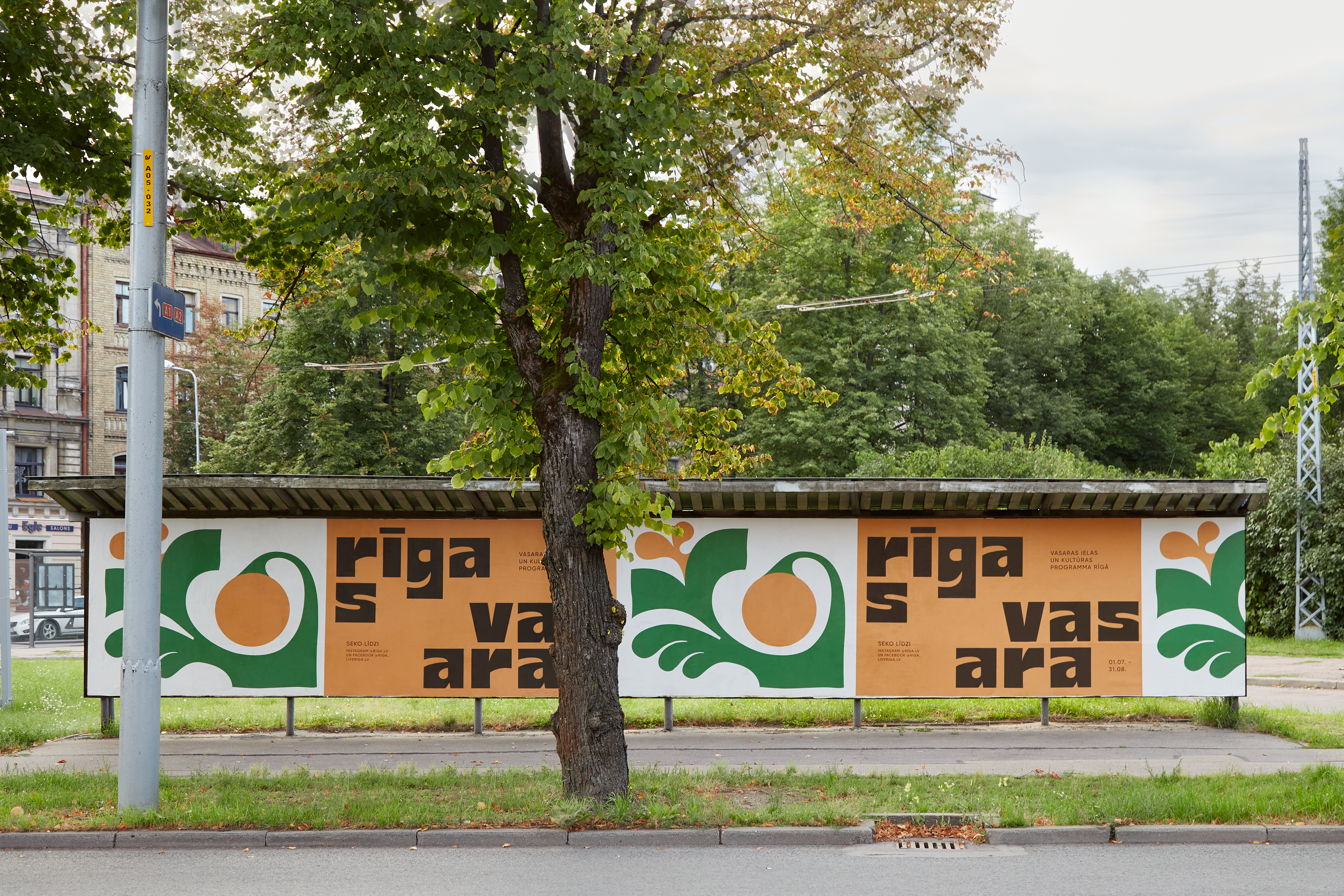
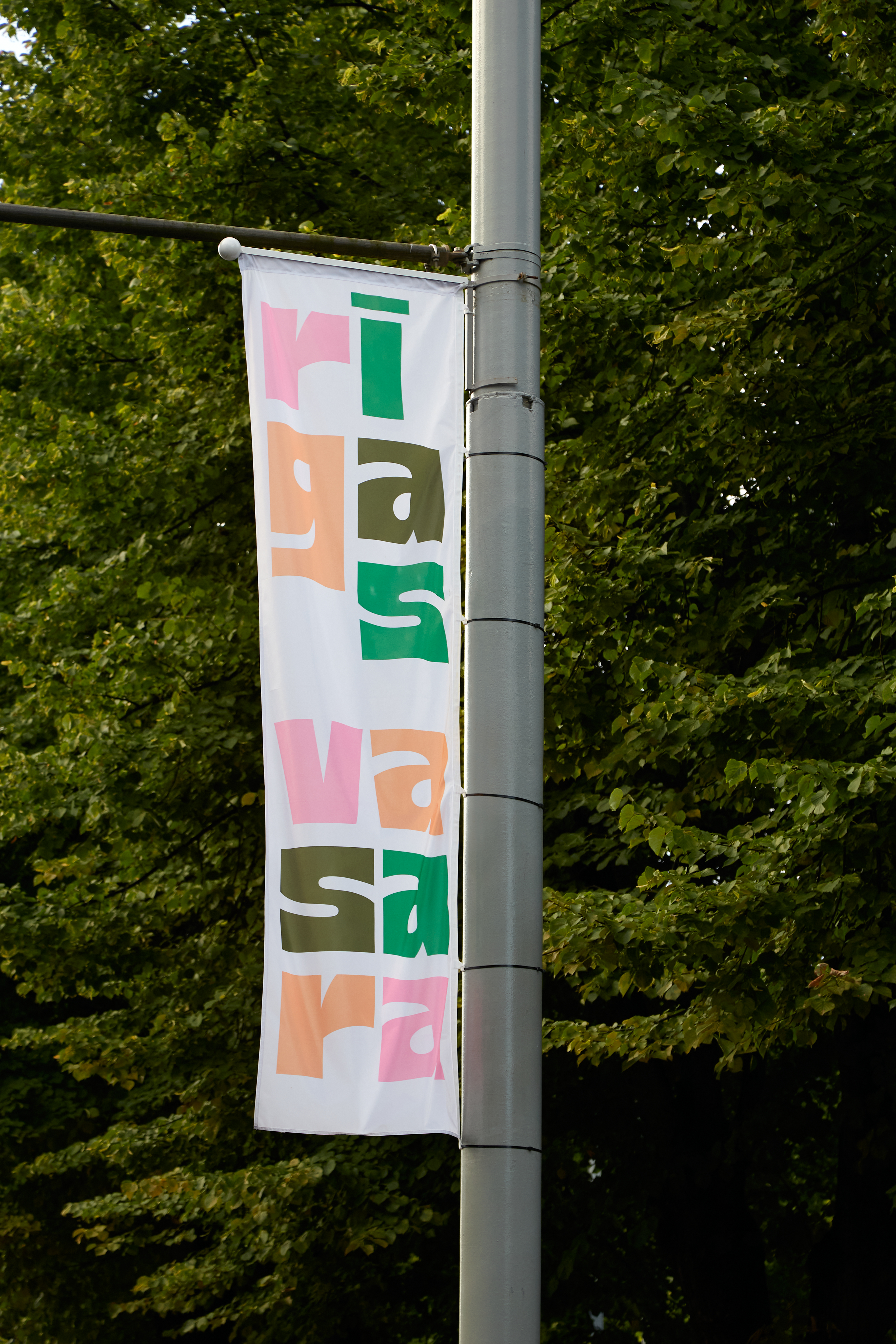
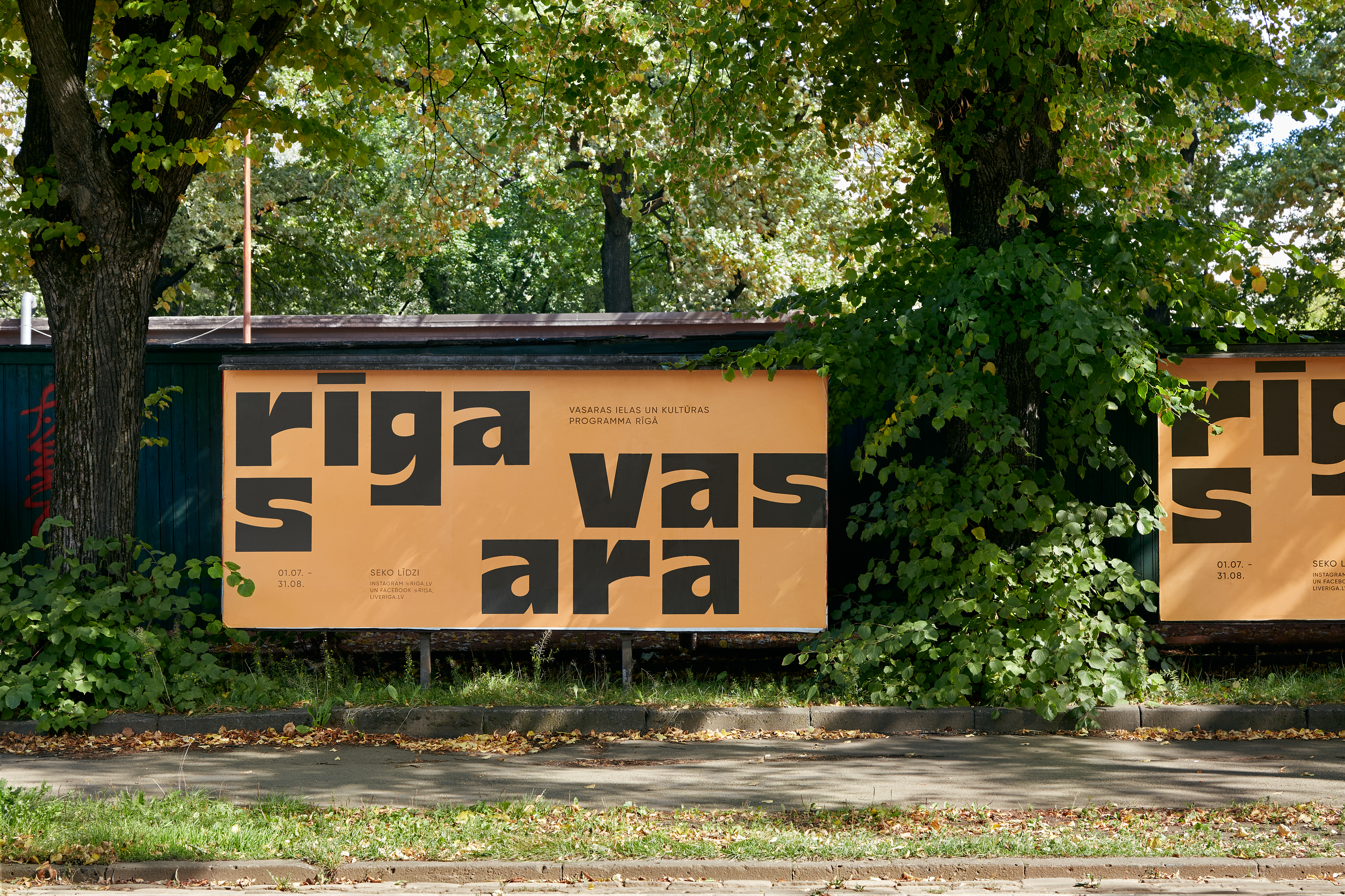
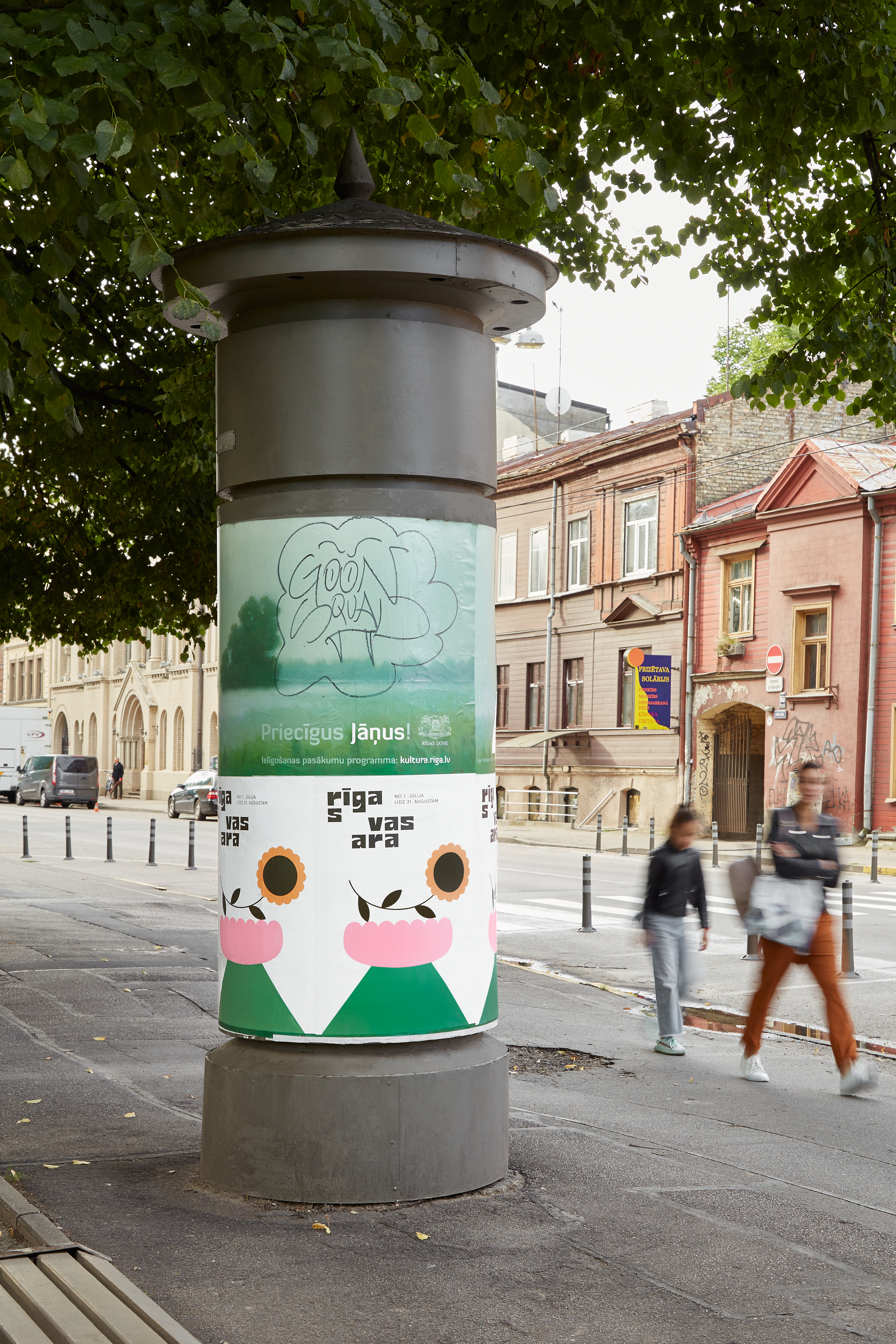
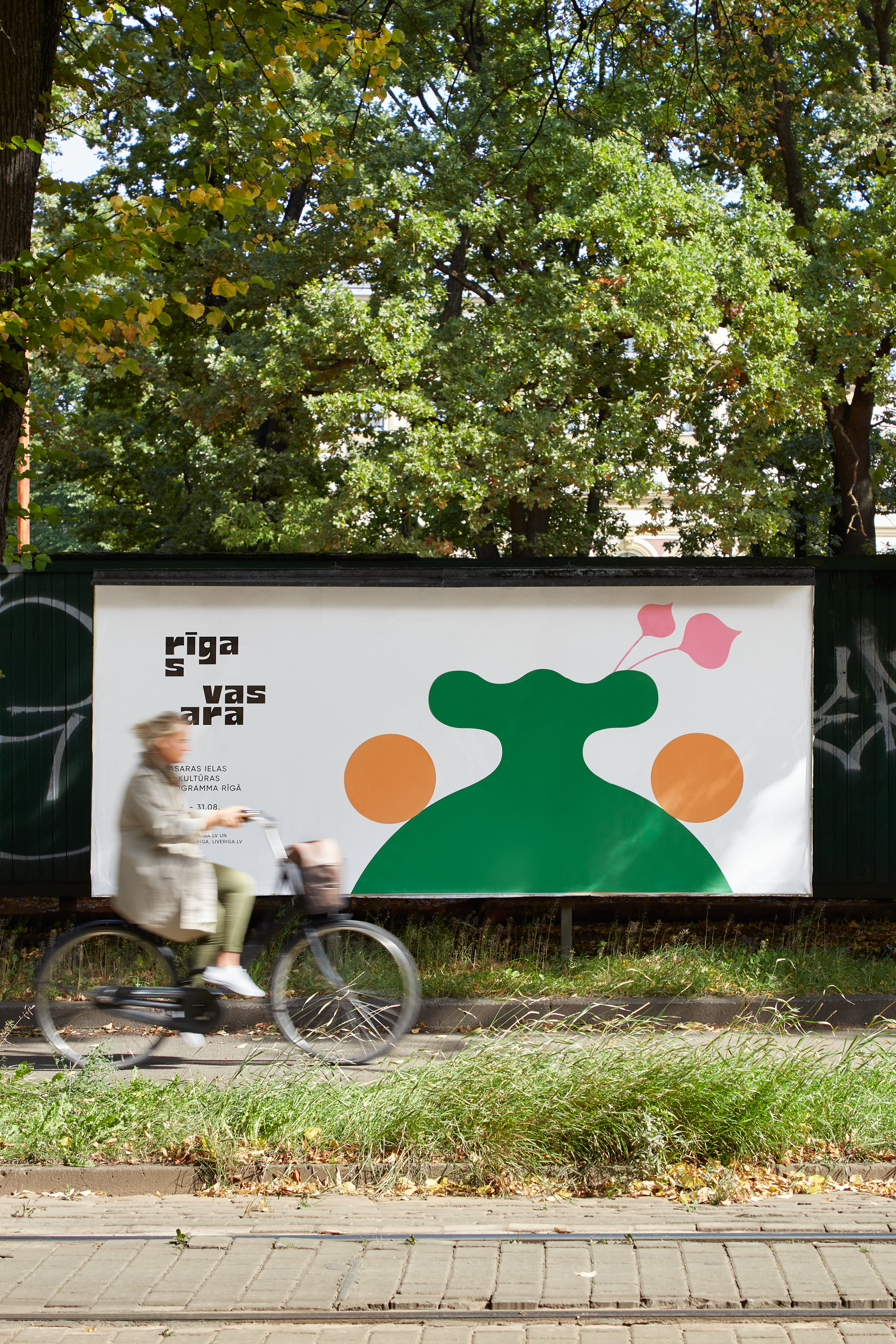
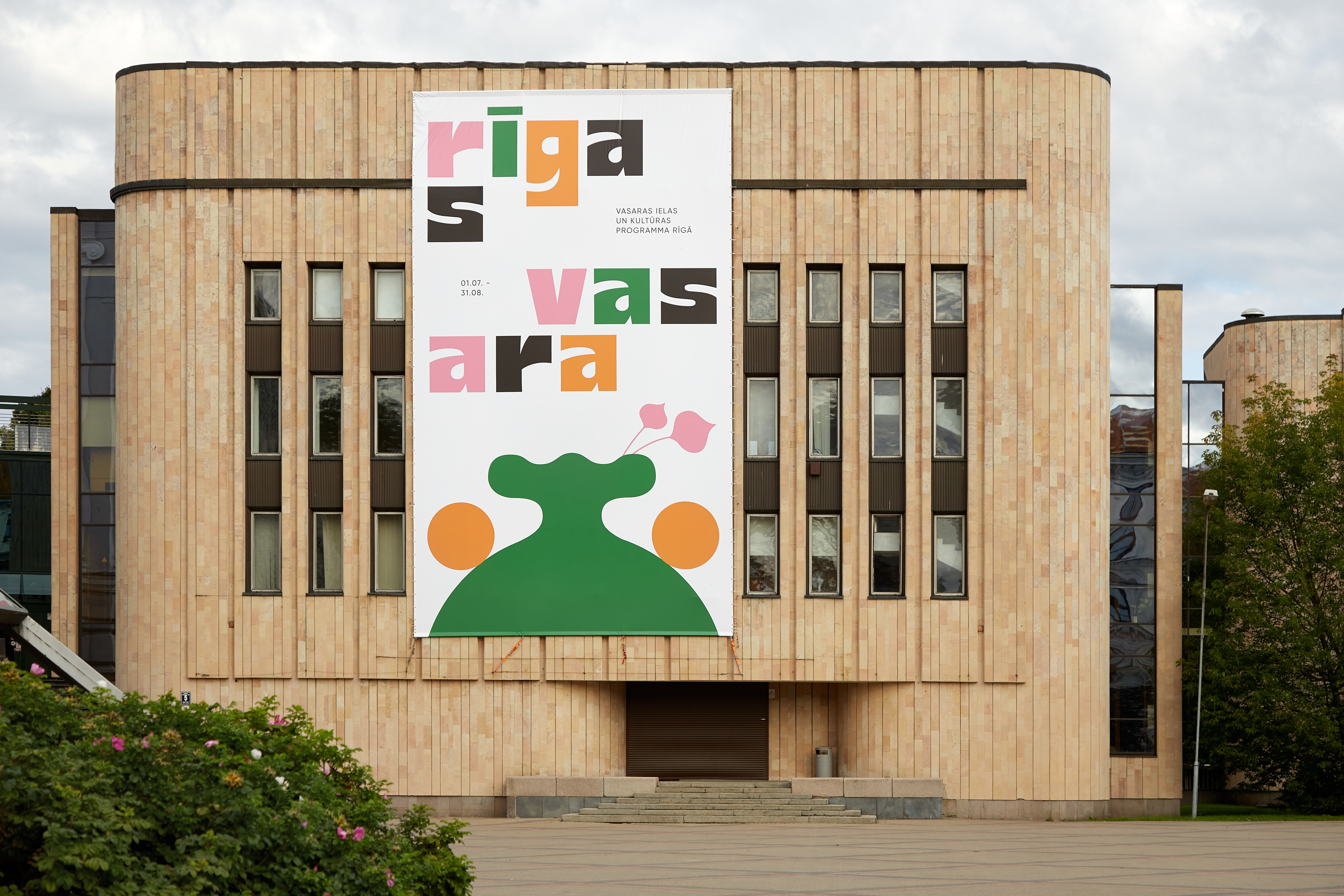
Visual identity that brought colours and joy to all districts of Riga
It is a visual language that is direct but can’t tell too much. It speaks about hidden initiatives all around the city.
The visual system is telling about events that pop up as pleasant and unexpected surprises for pandemic afflicted city dwellers. The colours and shapes create strange feeling of something familiar and novel simultaneously by playing with decorative elements of Riga’s architecture in combination with experimental typography and colours inspired by soviet times.
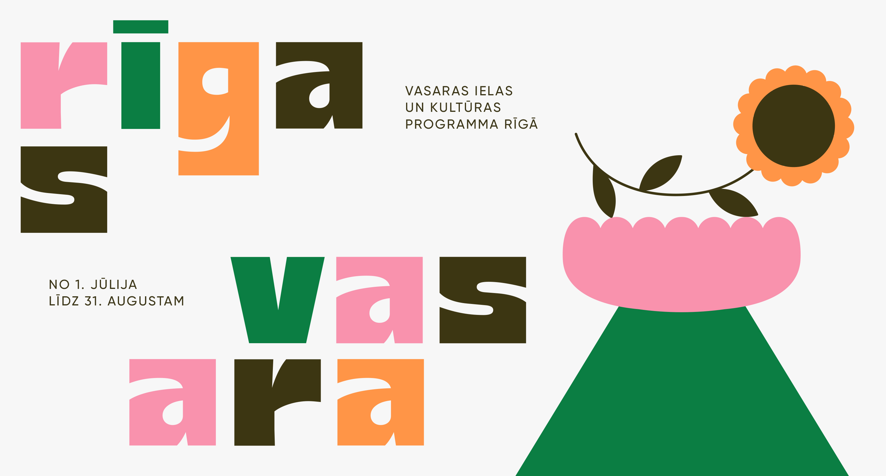
The visual identity created by me. Cretive direction of the Riga Summer Culture Program by Renāte Prancāne un Dārta Apsīte. Commisioned by Riga City Council.
Photography by Madara Gritāne.